
Pages that sell, designed in Figma.
We redesign the pages that carry your revenue: homepage, collections, product page and cart. Every change has a reason you can read, and every screen is ready to build.
What we redesign on Shopify stores.
Start where the money is. Not every page needs a new look, so we redesign the pages that decide the sale.
Homepage redesign
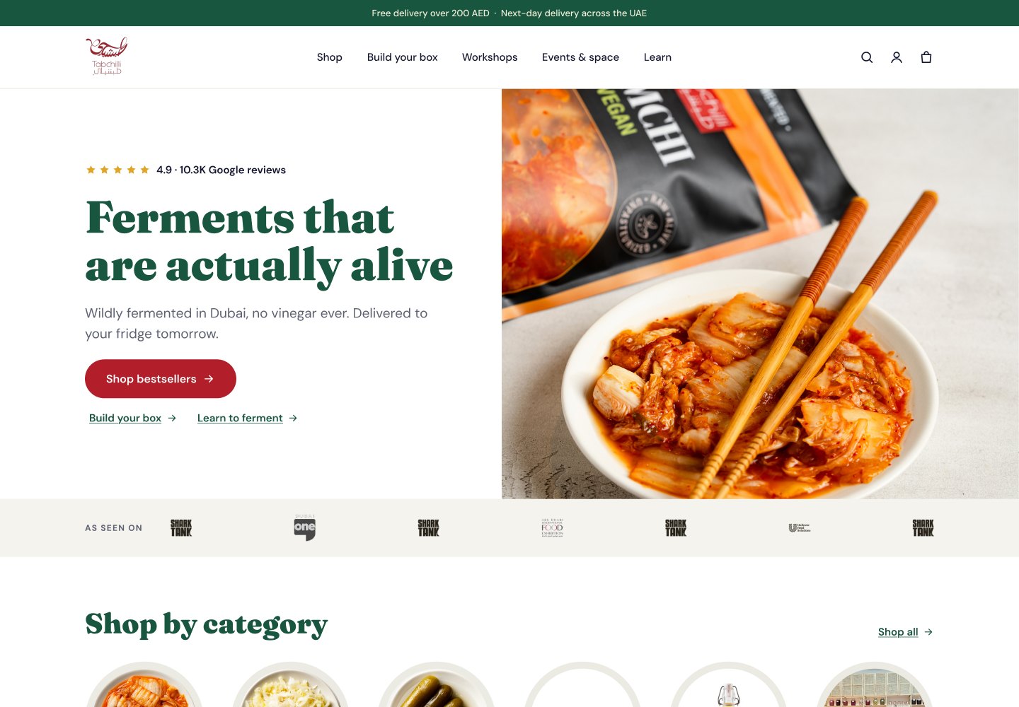
- One clear promise above the foldA headline, a short line of proof and one main button.
- Shop by category in one tapVisual shortcuts to the main categories, first on mobile.
- Bestsellers and proof earlyTop products and real reviews before the brand story.
- A path for first-time visitorsSections that answer “what is this, why trust it, where do I start”.
- Mobile layout firstDesigned for the phone first, then scaled up to desktop.
Product page redesign
- Title, price and rating togetherThe three things shoppers check first, in one block.
- Variant buttons instead of dropdownsSizes and colors visible at a glance, sold-out options clearly marked.
- Delivery date by the buttonA real date next to Add to cart, not a generic shipping line.
- Photos that answer questionsScale, details, in-use shots and what is in the box.
- Sticky add to cart on mobileThe button follows the shopper while they read reviews.
Collection page redesign
- Filters that match how people shopBuilt from your product data and real search terms.
- Cards with price, rating and badgesEnough on each card to compare without opening every product.
- Quick addAdd simple products to the cart straight from the grid.
- Clear sortingBestsellers by default, with price and new-in one tap away.
- Helpful empty statesSuggestions instead of a blank page when nothing matches.
Cart and drawer redesign
- Free-shipping progressA bar that shows how much is left, in money, as a goal.
- Upsells that fit the orderOne or two products from the same routine, one tap to add.
- Gift and reward stepsFree shipping, then a gift, then a discount, shown as steps.
- Trust and returns linesShort reassurance right above the checkout button.
- Express checkout buttonsShop Pay and Apple Pay placed where they help, not where they distract.
Landing pages for ads
- Message that matches the adThe same promise and visual the shopper clicked on.
- One offer, one actionNo menu detours. One product or bundle and one button.
- Proof from real customersReviews, before-and-after and numbers that back up the claim.
- FAQ that handles objectionsPrice, delivery, returns and “will it work for me” answered.
- Fast on mobileLight pages, because ad traffic is mostly phones on slow connections.
Shopify design system
- Colors and type that fit the brandA small set of styles that keeps every page consistent.
- Reusable sectionsBlocks you can rearrange for new pages without a designer.
- States: hover, empty, sold outDesigned up front, so nothing looks broken later.
- Mobile and desktop versionsEvery section designed for both, not just squeezed.
- Ready for the theme editorSettings your team can change without touching code.
What you get.
From the first wireframe to a file your developer can build from.
Figma files, desktop and mobile
Every page and state, organized so your team can find things.
A reason next to each change
Notes that explain why a block moved or changed, tied to the audit.
Wireframes first
We agree on structure before colors, so feedback rounds stay short.
Ready to build
Developer notes, or we build it ourselves in your Shopify theme.
How it works.
 1Message gets lost2No rating in view
Audit and design brief
What works, what leaks and what the brand needs. The redesign starts from findings, not taste.
Wireframes for every page
Structure for each page on mobile and desktop, agreed before any visual work starts.
Visual design in Figma
The full design in Figma, with clear feedback rounds and every state covered.
Developer handoff or Shopify build
Files and notes for your developer, or we build the design in your Shopify theme.
 ★★★★★
“Their blend of design daring and technical virtuosity really popped.”Phoebe Evans, CEO, e-commerce company · Clutch
Redesigns we did.
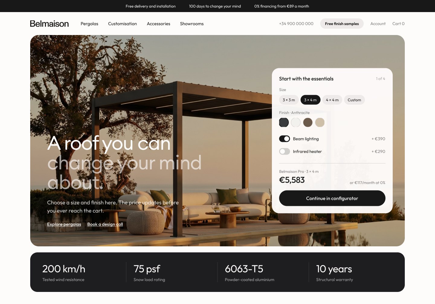
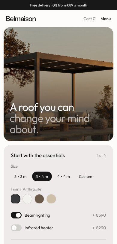
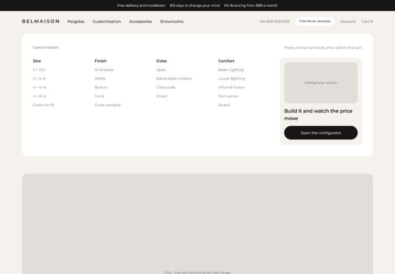
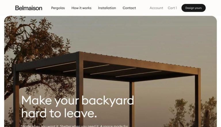
Belmaison
A new store, from wireframes and three design directions to launch.
Read case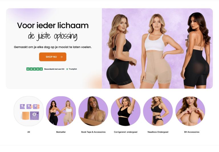
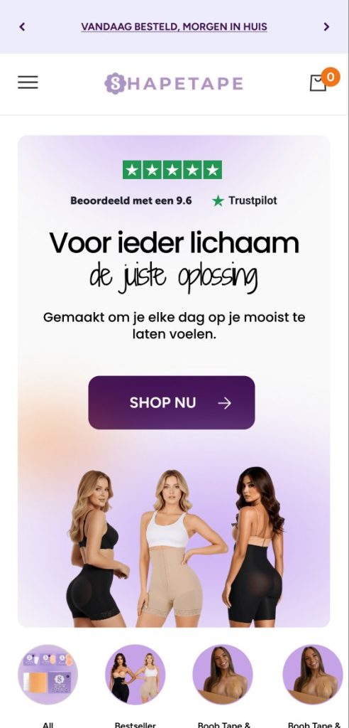
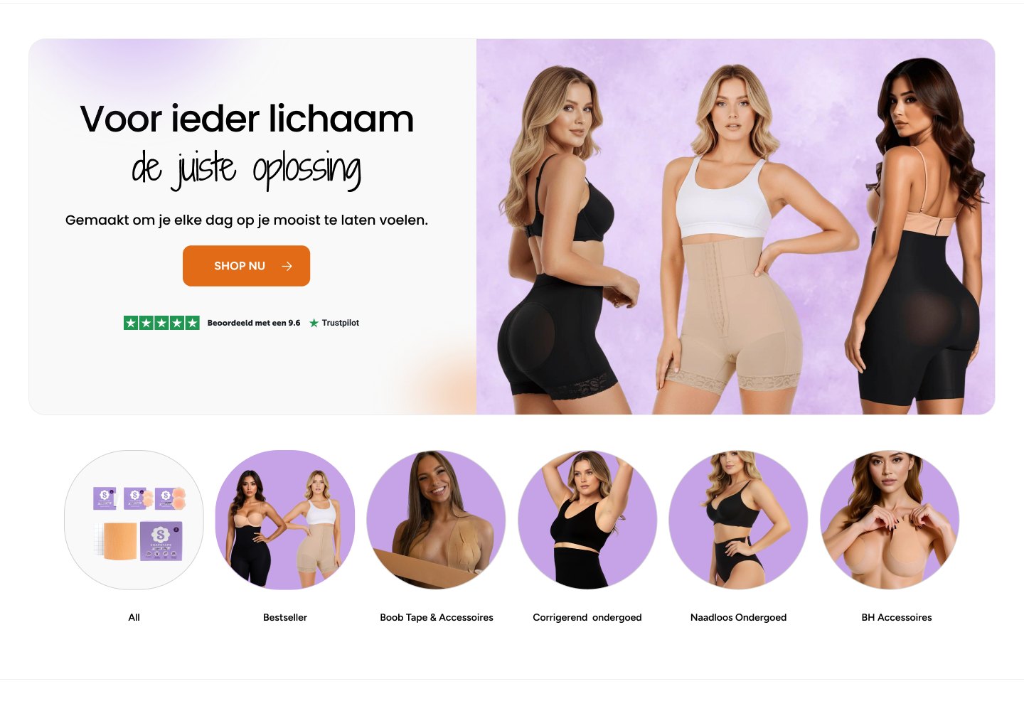
Shapetape
A homepage and collections that explain, prove and sell.
Read case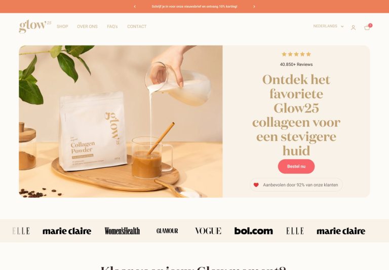
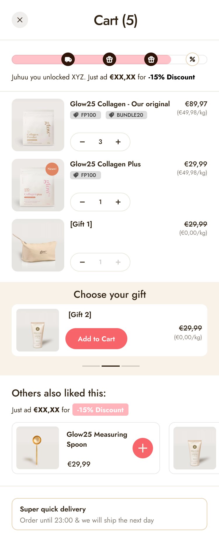
Glow25
A cart with tiered rewards and a gift picker.
Read caseQuestions.
How long does a redesign take?
It depends on how many page types we redesign. You get a timeline together with the fixed quote, before any work starts.
Do you redesign the whole store?
Only if it needs it. Most stores get the biggest lift from the product page, cart and homepage, so we usually start there.
Do we need to change our Shopify theme?
Not necessarily. We design for your current theme where it makes sense, and recommend a new one only when it would cost more to fight the old one.
Can you work with our brand guidelines?
Yes. We follow your brand and build a small set of reusable sections on top of it. If you don’t have guidelines yet, we create a simple one.
Can you also build it?
Yes. The same two people design and build, so nothing gets lost between Figma and the live store.
Let’s find what’s costing you sales.
Send your store. We’ll reply with the three biggest leaks we see. Free.
Prefer Upwork? Hire us there